Conversion architecture
Clearer offer hierarchy, stronger calls to action, and cleaner booking or buying paths so the next step feels obvious.
Loading
Portfolio
This page is not a gallery for filler work. It is technical and commercial proof showing how Web Growth handles premium UX, cleaner conversion flow, and stronger frontend execution across live brands.

Sort the work by the kind of build you care about. Live projects are marked clearly, and the concept piece is labeled as a proposal.
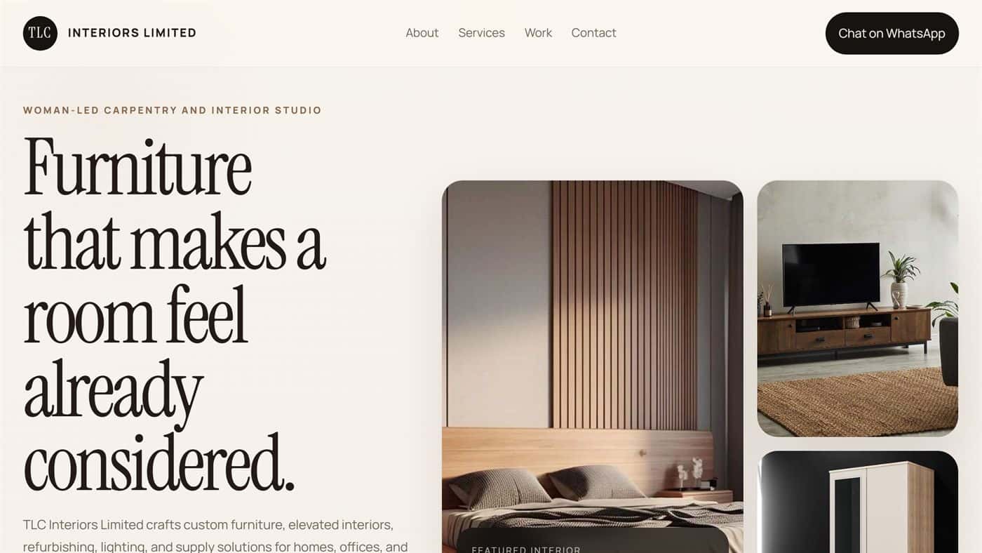
TLC Interiors Limited
Built a premium carpentry and interior design website that makes the offer feel more considered, easier to trust, and easier to enquire about.
Technical focus
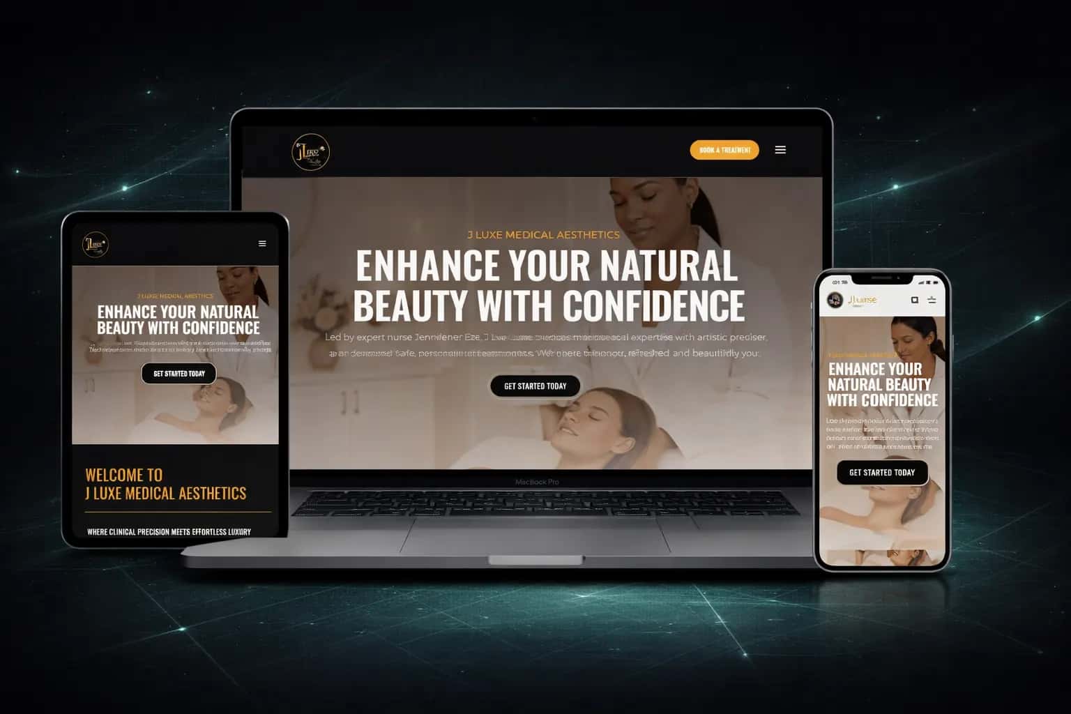
J Luxe Medical Aesthetics
Repositioned the clinic site around trust, treatment clarity, and a more premium first impression for colder traffic.
Technical focus
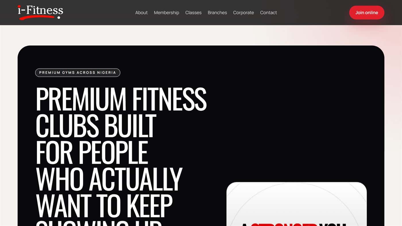
iFitness Concept
Created a conversion-focused proposal for a gym landing experience with a cleaner joining path, stronger offer hierarchy, and sharper mobile scanning.
Technical focus
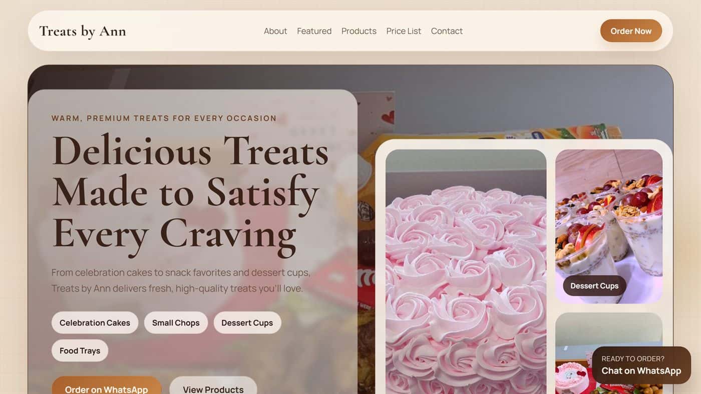
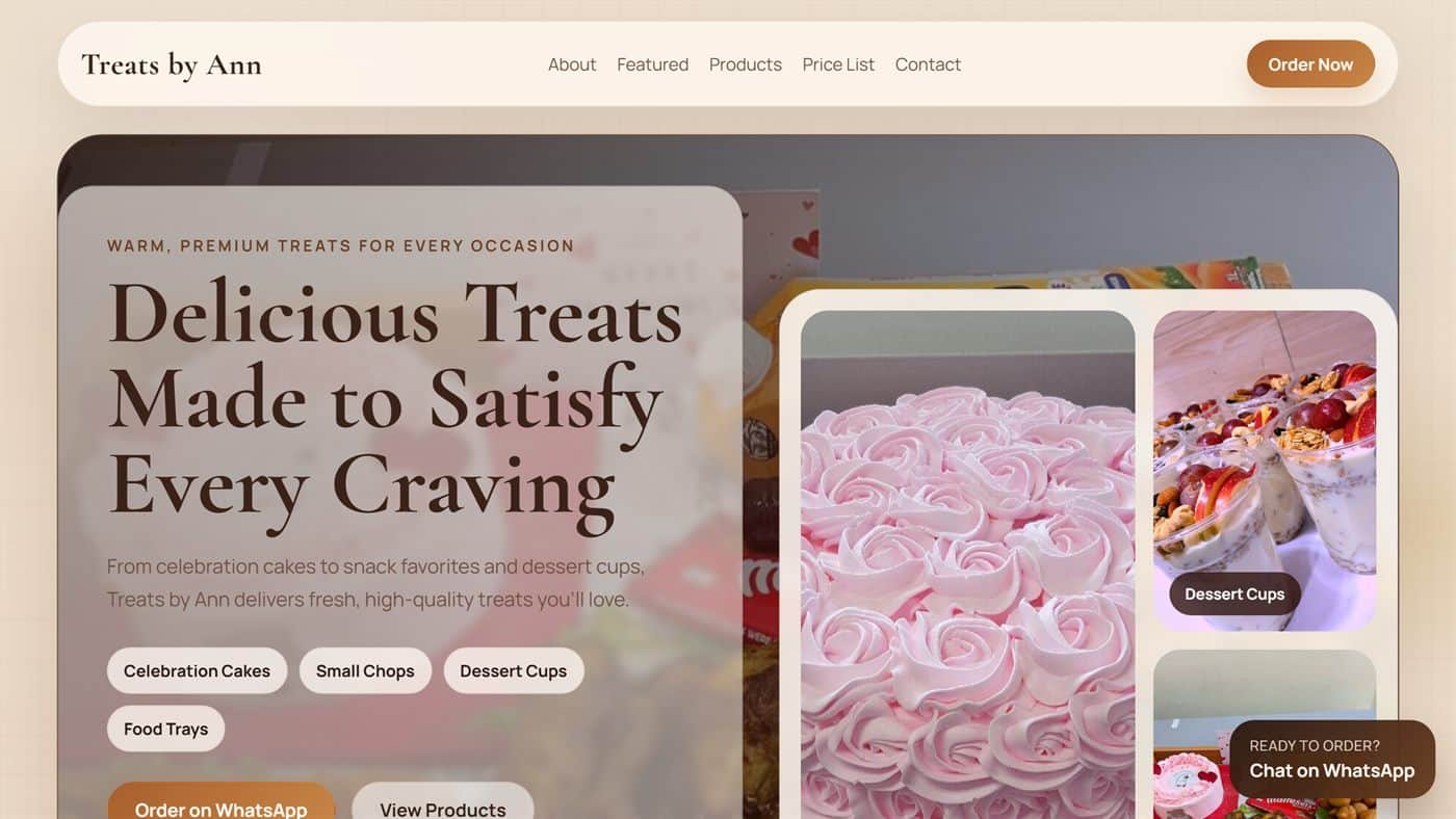
Treats by Ann
Built a bakery storefront that puts offers, categories, and visual trust in front of buyers quickly instead of burying them behind clutter.
Technical focus
Clearer offer hierarchy, stronger calls to action, and cleaner booking or buying paths so the next step feels obvious.
Lighter frontend decisions, stronger mobile presentation, and cleaner page structure that help the site feel faster and more trustworthy.
Sharper visual systems, better UX control, and a more scalable technical foundation than patched builder setups usually provide.
If the current site still feels generic, slow, or underpowered, request a quote and get a direct answer on the build that would move the business forward.