Premium Design Without Slow Pages: How to Build a High-End Website That Loads Fast
Part 5 of the J Luxe rebuild series: how to combine premium website design, Core Web Vitals, and conversion-focused UX without sacrificing speed or SEO performance.
Premium Design Without Slow Pages (Part 5)
A lot of business owners assume they must choose one of two options:
- a website that looks premium but loads slowly
- a website that loads fast but looks basic
Need website design in 48 hours?
If you need a professional website live fast for Nigeria-based or international clients, the launch offer is built for that exact use case.
Explore the full service at website design in 48 hours, see how to launch your website in 48 hours, or review the done-for-you website launch details.
That tradeoff is outdated.
If your team makes the right architecture and design decisions early, you can have both.
In this post, I am breaking down how we built a premium visual experience during the J Luxe Medical Aesthetics rebuild while still protecting page speed, SEO performance, and conversion flow.
If you missed the first four parts, start here:
- Why We Rebuilt, Not Redesigned (Part 1)
- The Audit That Created the Roadmap (Part 2)
- SEO Migration Without Losing Traffic (Part 3)
- Writing Service Pages That Convert (Part 4)
For teams planning scope before UI decisions, this website redesign checklist for small businesses helps prioritize trust, speed, SEO, and conversion in the right order.
Part 5 is where aesthetics and performance meet.
Why "premium design" often damages performance
Most slow websites are not slow because of one huge mistake.
They are slow because small visual decisions stack up:
- oversized hero media shipped without compression
- too many decorative animation layers running continuously
- custom fonts loaded without fallback strategy
- heavy UI libraries used for simple interactions
- card and section effects duplicated across templates
Design teams usually notice the visual result.
Users notice the lag.
Search engines notice the lag too.
When that happens, rankings, engagement, and lead quality all decline together.
If you want to rank for competitive terms like `website design`, `web design`, and `website performance optimization`, visual polish cannot come at the cost of Core Web Vitals.
The principle we used: design quality and speed are one system
Our rule was simple:
`No design element is complete until its performance cost is validated.`
That forced better decisions in real time.
For every "beautiful" layer, we asked:
- 1Does this improve trust or clarity?
- 2Does it help conversion behavior?
- 3Can we achieve it with lower render cost?
- 4Does it still work on lower-powered mobile devices?
If the answer was no, we removed or simplified the element.
This is one of the fastest ways to improve both user experience and conversion rate optimization.
The premium visual framework that did not bloat the site
A premium brand feel does not require visual overload.
We used five visual controls.
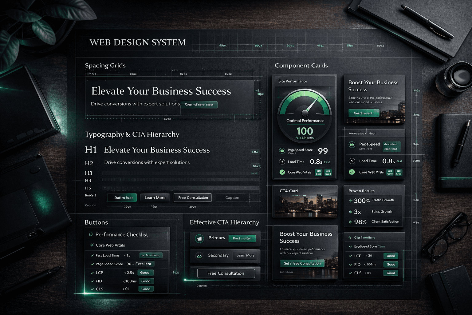
1) Strong hierarchy before decorative detail
We prioritized:
- clear H1/H2 structure
- disciplined spacing rhythm
- predictable CTA contrast
- high legibility in all viewport sizes
When hierarchy is strong, you need fewer visual tricks.
2) Limited accent system
Instead of many accent colors, we used one primary accent system and controlled highlight usage.
That made the interface feel intentional and high-end while reducing noisy UI variation.
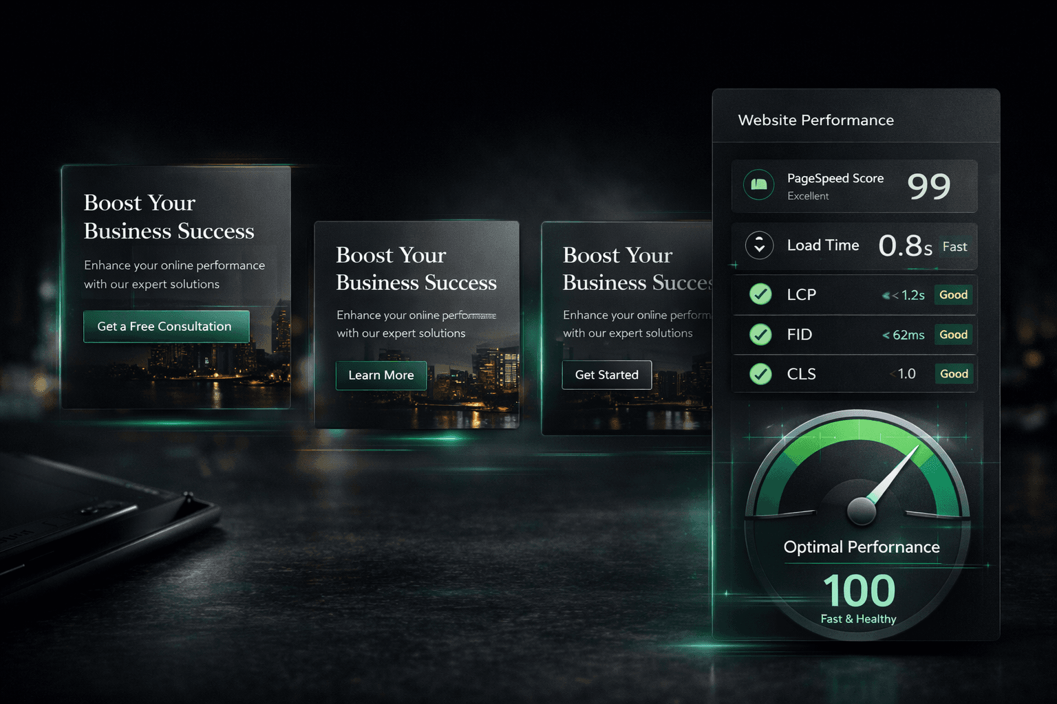
3) Reusable card language
Cards followed one pattern across launch, pricing, social proof, and FAQ sections:
- consistent border behavior
- controlled glow and depth
- readable text blocks
- clear action priority
Consistency is a premium signal.
4) Motion with purpose
Animation was used for orientation and micro-feedback, not decoration.
We limited motion to:
- section reveal
- CTA and card hover feedback
- low-intensity atmosphere effects
5) Content-first sections
No section shipped without a clear conversion purpose:
- explain value
- reduce objection
- build trust
- route to action
This is how visual quality supports sales instead of distracting from it.
Performance guardrails we enforced during design implementation
These guardrails protected speed while design quality improved.
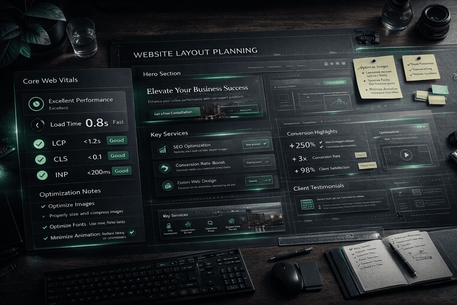
Image strategy
- all blog and section visuals converted to `.webp`
- responsive image sizing enforced
- only critical visuals loaded eagerly
- non-critical visuals lazy-loaded
If your website is image-heavy, this alone can create major speed gains.
Font strategy
- controlled font family count
- practical fallback stack
- no unnecessary weight variants
- optimized rendering to reduce layout shift
Premium typography should feel smooth, not heavy.
Component strategy
- reusable components over repeated custom blocks
- avoid large libraries for small UI effects
- keep logic minimal in above-the-fold sections
- push non-critical scripts to lazy load
CSS and animation strategy
- prefer transform/opacity for animations
- avoid expensive layout-triggering animations
- set reduced-motion behavior for accessibility and stability
- remove decorative layers that do not add UX value
SEO + performance alignment
- preserve crawlable semantic structure
- keep heading hierarchy clean
- ensure visuals do not delay critical content rendering
- validate indexability after every major visual update
This balance matters if you want high-intent traffic and conversions from the same page.
For a practical speed checklist, use this companion guide: How to Make Your Website Load Fast.
The exact UX areas where speed and premium design intersect
Most teams treat these separately.
They should be handled together.
Above-the-fold hero
The hero should communicate value fast, not just look impressive.
Our hero rules:
- headline clarity in under 3 seconds
- one primary CTA and one supporting CTA
- controlled media weight
- readable contrast across devices
A premium hero that takes too long to render is a conversion leak.
Trust and proof sections
Proof sections should load quickly and remain easy to scan.
We used:
- concise case summaries
- consistent card dimensions
- predictable text hierarchy
- selective interaction feedback
This reduced cognitive friction and helped visitors move to action faster.
Pricing blocks
Pricing must be legible and immediate.
We focused on:
- clear package naming
- explicit USD pricing
- concise scope bullets
- single-action CTA structure
When pricing clarity is high, you get better-qualified enquiries.
FAQ sections
FAQ helps both UX and SEO when built correctly.
We avoided bloated answers.
Instead, each FAQ was written to resolve one practical buying hesitation quickly.
This improves time-on-page and supports decision confidence.
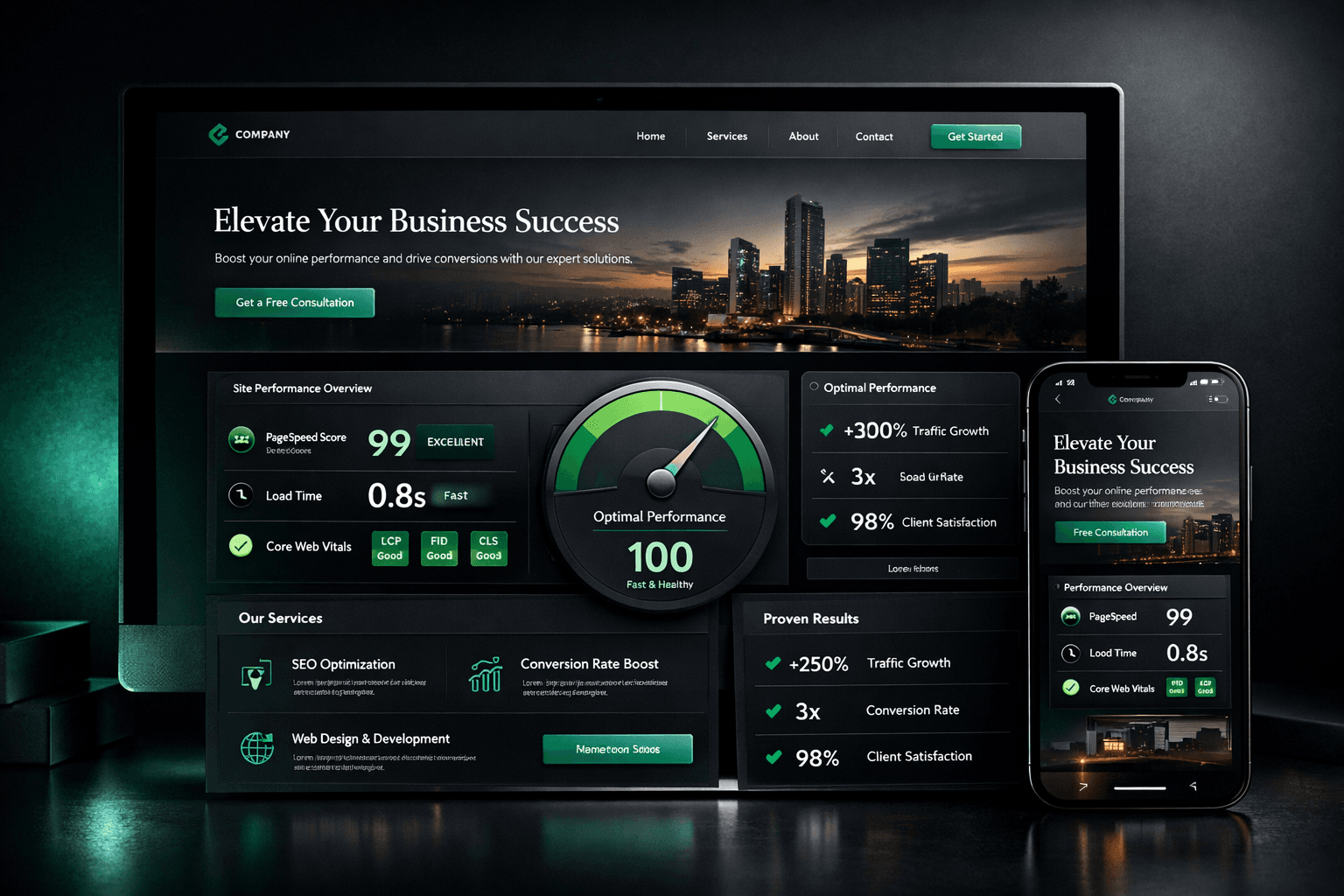
Core Web Vitals targets we used as design constraints
We treated Core Web Vitals as design boundaries, not only developer metrics.
Primary targets:
- LCP (Largest Contentful Paint): keep critical content fast
- CLS (Cumulative Layout Shift): prevent unstable visual movement
- INP (Interaction to Next Paint): keep interactions responsive
If your design plan ignores these, premium visuals can quietly damage both rankings and sales.
This is especially true for service businesses where trust and speed influence first impressions.
A practical checklist: premium feel without performance debt
Use this before launch.
Visual and UX
- Is visual hierarchy obvious in under 3 seconds?
- Is CTA priority clear in every key section?
- Do cards and trust blocks use one consistent pattern?
- Is mobile spacing tuned, not simply scaled down?
Performance
- Are hero assets optimized and compressed?
- Are non-critical effects deferred or removed?
- Are animations using low-cost properties?
- Is reduced-motion mode fully usable?
SEO and discoverability
- Are titles, meta, and heading structure clean?
- Are internal links guiding users to relevant next steps?
- Is indexability stable after visual changes?
- Are critical pages still passing technical QA?
If this checklist passes, your site can look high-end and still perform like a growth asset.
What changed after we applied this system
The biggest improvement was not one isolated metric.
It was alignment.
The website started to work as one engine:
- premium perception improved trust
- performance improvements protected engagement
- clearer UX increased action intent
- cleaner structure supported SEO growth
That is the real win.
Design, speed, and conversion stopped competing.
They started compounding.
If you want this same approach for your own business website, this offer is the fastest path: website design in 48 hours.
Next in the series
Part 6 covers the build layer:
**Next.js architecture and build decisions**
We will break down the technical choices, component strategy, and implementation tradeoffs that made the rebuild faster to ship and easier to maintain.
Ready to launch
Launch your website in 48 hours with a done-for-you setup
If this article helped you clarify the next step, the launch offer gives you a mobile-first business website, domain guidance, hosting setup, and a clear CTA flow without dragging the project out.
Chat on WhatsAppWebsite design in 48 hours for businesses that need to go live fast
The 48-hour launch offer is built for businesses that need a clean, mobile-first site live fast with pricing, CTA flow, and basic SEO already handled.
See the done-for-you website launchRelated posts
More articles to help you get better rankings and more leads.
Part 6 of the J Luxe rebuild series: the Next.js architecture decisions that improved performance, crawlability, publishing speed, and long-term maintenance during the rebuild.
Part 4 of the J Luxe rebuild series: how to write service pages that rank in local SEO and convert visitors into qualified enquiries using a practical, repeatable framework.
Part 2 of the J Luxe rebuild series: how a structured website audit, technical SEO audit, and conversion audit created a clear rebuild roadmap without wasted redesign work.