How to Build High-Converting Landing Pages (Turn Visitors Into Enquiries Automatically)
Traffic is useless without conversions. Learn the exact landing page structure, copy psychology and layout that turns visitors into leads and sales.
Our articles are written and reviewed in-house using real website launch, redesign, technical SEO, and conversion work. We update posts when our process changes, and we keep the advice aligned with what we actually implement for businesses in Nigeria and remote international markets.
How to Build High-Converting Landing Pages

Most websites look nice.
Almost none convert.
Need website design in 48 hours?
If you need a professional website live fast for Nigeria-based or international clients, the launch offer is built for that exact use case.
Explore the full service at website design in 48 hours, see how to launch your website in 48 hours, or review the done-for-you website launch details.
That's the uncomfortable truth.
Design does not equal sales.
Pretty does not equal profitable.
A landing page has only one job:
Get the visitor to take ONE action.
If it doesn't...
It's decoration.
And decoration doesn't pay bills.
Let's fix that properly.
If you're getting visitors but no enquiries, read Why Your Website Isn't Getting Leads.
If you already know you need a focused page for ads or campaigns, see the landing page design service.
First principle: clarity beats beauty
Visitors don't read.
They scan.
They decide in 3-5 seconds:
"Is this for me or not?"
If your message isn't instantly obvious...
They leave.
Not because they hate you.
Because they're busy.
Clarity wins.
Every time.
What is a landing page really?
Not your homepage.
If you need a high-performing homepage instead, see Homepage Structure That Converts.
Not your about page.
A landing page is:
ONE page ONE offer ONE goal ZERO distractions
No menu. No extra links. No wandering.
Just focus.
Think of it like a sales person trapped inside a single page.
Everything must support the sale.
Everything else dies.
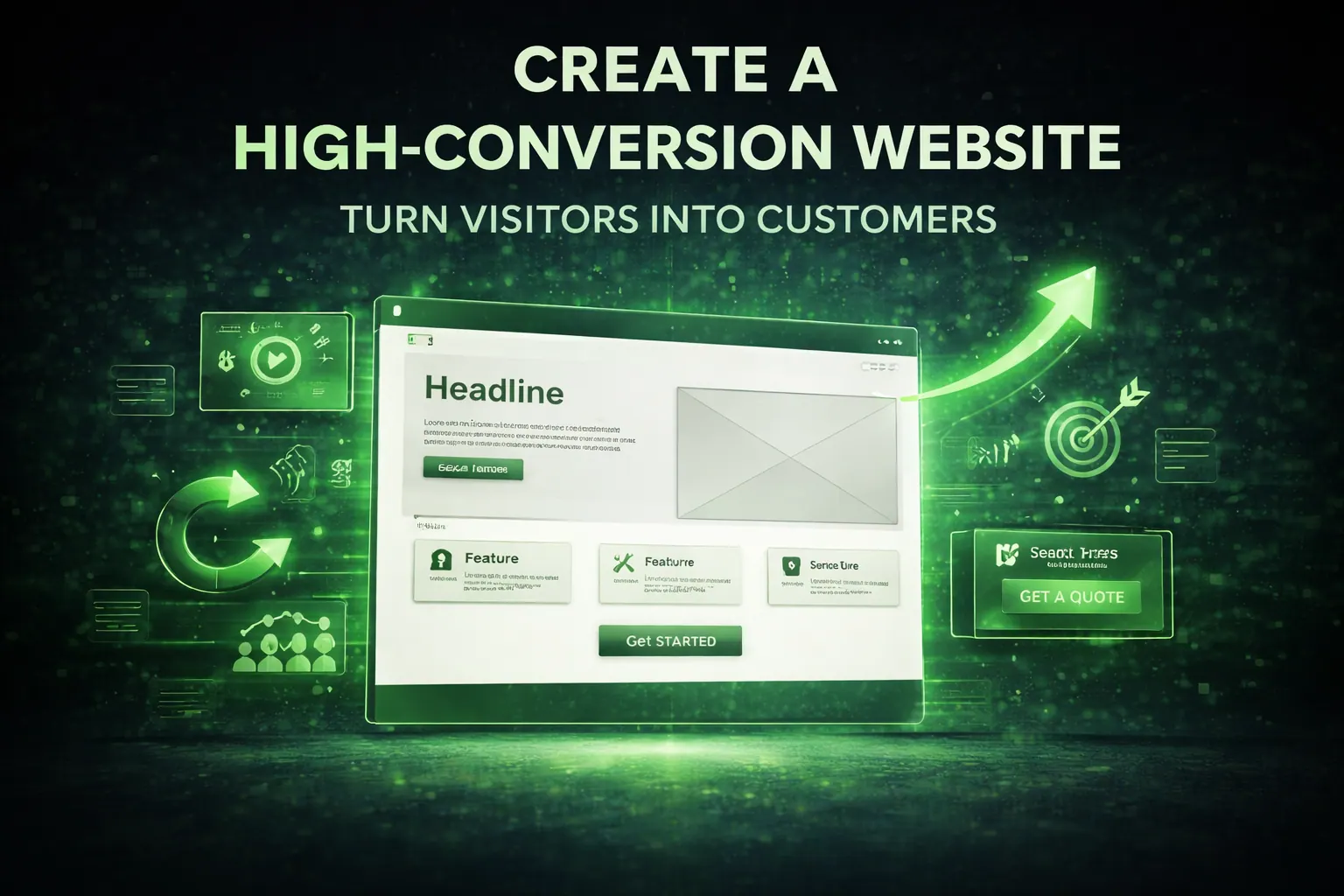
The exact structure that converts
Steal this.
Don't reinvent.
This structure has sold billions online.
Section 1: The headline (the hook)
This is life or death.
If your headline is weak, nothing else matters.
Bad: Welcome to our website
Nobody cares.
Good: Get 5-10 New Clients Every Month Without Running Ads
Now you have attention.
Formula:
Clear result + who it's for + time frame or benefit
Example: Web Design for Clinics That Want More Bookings in 30 Days
Specific wins.
Generic loses.
Section 2: Subheadline (explain simply)
Your headline hooks.
Your subheadline explains.
Keep it plain.
No jargon.
No fluff.
Example:
We design fast, SEO-optimised websites that turn visitors into enquiries automatically.
Simple beats clever.
Always.
Section 3: Visual proof

Humans trust what they see.
So show:
- screenshots
- results
- mockups
- before/after
- real projects
Not stock photos of smiling people shaking hands.
Nobody trusts those anymore.
Reality > polish.
Section 4: Benefits (not features)
Features are boring.
Benefits sell.
Feature: Fast hosting
Benefit: Your site loads instantly so visitors don't leave
Feature: SEO
Benefit: Customers find you on Google without paying ads
Always translate:
Feature -> what it does -> why it matters
Because customers buy outcomes.
Not tools.
Section 5: Social proof
This is where trust explodes.
Add:
- testimonials
- reviews
- numbers
- logos
- case studies
Example:
"We got 47 enquiries in the first month."
That line sells more than any design trick.
Because it's proof.
Proof kills doubt.
Section 6: Offer breakdown
Explain clearly:
What they get How it works What happens next
Don't make people guess.
Confusion kills conversions.
Spell it out like you're talking to a tired 10-year-old.
Because most visitors skim like one.
Section 7: Risk reversal
People fear losing money.
So remove risk.
Examples:
- free consultation
- money-back guarantee
- no contract
- cancel anytime
Lower risk = higher conversions.
Simple psychology.
Section 8: Strong CTA
Your CTA must punch.
Not whisper.
Bad: Submit
Lazy.
Good: Get My Free Quote Book My Strategy Call Start My Project
Make it about THEM.
"My" converts better than "your".
Tiny detail.
Huge impact.
Section 9: Remove everything unnecessary
This is where most people fail.
They add:
- 12 links
- full navigation
- footer junk
- random pages
Now visitors wander.
Wandering = no sale.
Landing pages should feel like a tunnel.
Forward only.
No exits.
Mobile matters more than desktop
Most traffic is mobile.
So:
- big buttons
- short text
- stacked sections
- fast load
- no tiny fonts
If it sucks on mobile, you lose half your sales.
Instantly.
Test on your phone.
Always.
Copywriting tips that boost conversions instantly
These are unfair advantages:
Use short sentences Use bullet points Use simple words Avoid jargon Write like you talk
And most important:
Talk about THEM more than YOU.
Bad: We are a leading company with 10 years experience
Good: You get a fast website that brings enquiries
Nobody cares about you.
They care about themselves.
Harsh but true.
Pair your landing page with follow-up by reading Email Marketing for Small Business.
Speed = conversions
Every extra second reduces conversions.
Facts.
For technical fixes, use the Speed Checklist That Improves Rankings.
And if the page is being held back by weak infrastructure, review the hosting offer before you scale traffic.
So:
- compress images
- remove heavy scripts
- lazy load media
- use good hosting
Fast pages feel trustworthy.
Slow pages feel suspicious.
Humans are weird like that.
A simple landing page formula
If you're overwhelmed, use this:
Headline Subheadline Image Benefits Proof Process CTA
That's enough.
No fancy tricks needed.
Just clarity.
The silent killer: too much text
People don't read essays.
Break content into:
- short blocks
- bullets
- sections
White space sells.
Walls of text repel.
Design for scanning.
Not reading.
Test everything
Never assume.
Test:
- headlines
- buttons
- images
- layouts
- offers
Small tweaks can double conversions.
Literally.
Marketing is experimentation.
Not guessing.
Final mindset shift
Your landing page isn't art.
It's a machine.
Machines are judged by output.
Not beauty.
If it converts, it's good.
If it doesn't, it's trash.
Be ruthless.
Cut what doesn't perform.
Final thought
Traffic is expensive.
Clicks cost money.
So every visitor matters.
A good landing page multiplies revenue.
A bad one burns it.
Build the page like your income depends on it.
Because it does.
Need a landing page built for you? Request a quote.
Related reads
- Why Your Website Isn't Getting Leads
- Speed Checklist That Improves Rankings
- Homepage Structure That Converts
Ready to launch
Launch your website in 48 hours with a done-for-you setup
If this article helped you clarify the next step, the launch offer gives you a mobile-first business website, domain guidance, hosting setup, and a clear CTA flow without dragging the project out.
Chat on WhatsAppWebsite design in 48 hours for businesses that need to go live fast
The 48-hour launch offer is built for businesses that need a clean, mobile-first site live fast with pricing, CTA flow, and basic SEO already handled.
See the done-for-you website launchHosting Support
Need reliable hosting before you build?
Use the hosting offer to start with a cleaner setup and a lower upfront cost.
Related posts
More articles to help you get better rankings and more leads.
Most low-converting websites fail for the same reasons: unclear positioning, weak proof, poor mobile trust, and weak calls to action. Fix these first.
Most small business websites look good but don’t sell. Learn the exact structure, psychology and layout that turns visitors into enquiries automatically.
A service page should answer five buyer questions fast: what you do, who it is for, why it is credible, what is included, and what happens next.