A clinic website designed to present treatments clearly, build trust quickly, and support consultation enquiries in London.
Loading
Loading
Case studies and selected work
Explore real Web Growth projects and the thinking behind them. Each example is presented with honest qualitative outcomes, not fabricated performance claims.
Portfolio outcomes describe delivered design and implementation improvements. Unless a case study names a baseline, date range, and measurement source, they are not claims of measured traffic, ranking, revenue, or conversion gains.

Featured project
A polished medical aesthetics website built to explain treatments, create a calmer first impression, and make it easier for visitors to book, call, or ask questions.
A clinic website designed to present treatments clearly, build trust quickly, and support consultation enquiries in London.
Project gallery
A polished medical aesthetics website built to explain treatments, create a calmer first impression, and make it easier for visitors to book, call, or ask questions.

A modern interior design website created to present services, finished spaces, and craftsmanship in a more premium and easier-to-trust way.

A polished treats website designed to make categories easier to browse, featured products easier to notice, and WhatsApp ordering easier to start.
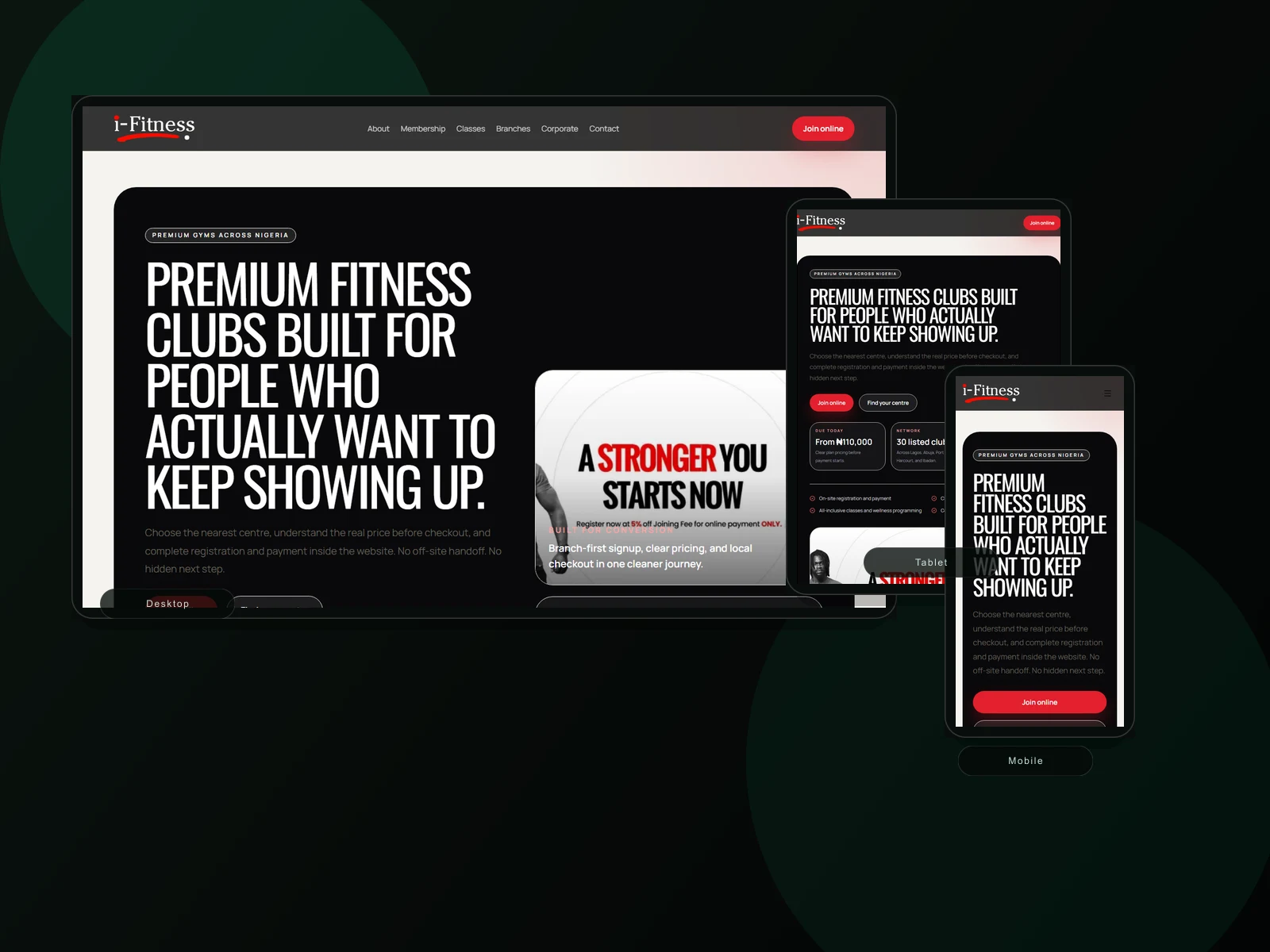
A conversion-focused fitness website built to present locations, membership information, classes, and sign-up intent in a cleaner way.
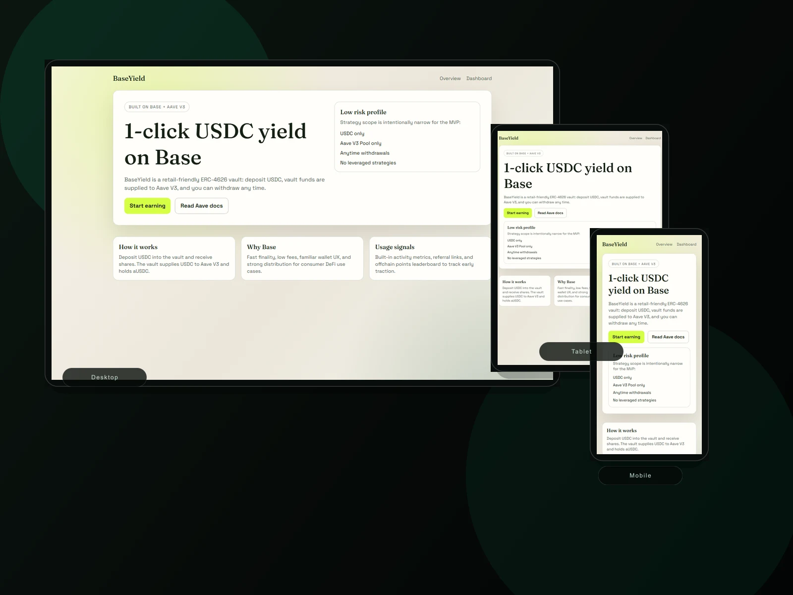
A sleek digital-finance style website focused on product clarity, low-risk framing, and a cleaner path into the vault dashboard.
How the work is shaped
The portfolio highlights how Web Growth connects business context, site structure, responsive presentation, and conversion paths.
Understand the business, offer, audience, and trust gaps before shaping the page.
Organise services, products, proof, and calls to action around buyer decisions.
Use responsive visuals, hierarchy, and premium spacing to make the brand easier to trust.
Connect the project to SEO, conversion, booking, ordering, or lead-generation priorities.
Next step
Send Web Growth your current website or project idea and get a practical recommendation on what to fix, build, or redesign first.
Start With a Website Review